Tuesday, March 31, 2009

APRIL FOOLS DAY VIRUS ALERT

Just to remind you that the Conficker virus looks set to go out from midnight tonight.


Copyright-free image from Tack-o-Rama


The usual April Fool's Day fun (not). This warning was sent to me by Dawn (GoldBettyBoop). God bless you, girl!

Here are the links:
So can I PLEASE urge you all to update your virus checkers and firewalls.

Here is the Microsoft link to install the Windows Live OneCare scanner (free) which will eradicate the virus. You need to download this via Internet Explorer (not Firefox) and then run it - it will take several hours to do a full scan, so allow yourself enough time.

And if you have just one password for all of your stuff (your bank, PayPal & eBay etc) please change it so you have separate passwords - a mix of letters and numbers is best. Just think of something off the top of your head, the sillier the better. And don't forget to write them down - this means NOT typing a list on your computer and saving it, by the way. Keep a little book by your computer and hand write this stuff in. If you get a trojan or the Conficker virus, they will go through your entire system and rip any passwords you may have thought you hid there. Also any banking details.

Whilst you are at it, you might as well do a little housekeeping:
  • Go to Accessories > System Tools > ScanDisc to remove any clutter in your system
  • Go back to System Tools and Defragment
  • Back to System Tools to create a System Restore point
  • Back up all your stuff onto CDs or DVDs or an external hard drive
  • Go to Microsoft/Windows Update for the latest downloads
I know this is something we don't usually bother to do regularly (although you should be updating your Virus Checker & Firewall at least twice a week, and running Scan Disc and Defragment weekly) so you might as well do it all now for your own peace of mind.

After all that, your computer should be skipping around like a newborn lamb and you should have all the latest security stuff ready to swing into action to protect you.

And the usual common-sense stuff: don't open any weird-looking emails or attachments (run a scan first if you think you need to see them) and if you get emails from any banking groups, insurance companies etc - or eBay or PayPal - don't click on any links the email. Go to the company's main website and then go into your account to see any messages. There are a lot of clever spoofs out there, and the web pages LOOK genuine, but aren't (I got caught that way).

I'm sure you'll think I am paranoid - but better safe than sorry.

Friday, March 27, 2009

PINK SATURDAY POST: BUTTONS

This week's Pink Saturday post is all about buttons!

This is cheating a little, but I couldn't resist! It still features buttons.... of a sort...
Image from Art-e-zine


I've always been fascinated by buttons.

I'm sure most of us had grandmothers with button drawers (mine also had a thread & ribbon drawer and a jewellery box with odd earrings, brooches with stones missing, and broken neckalces) and kept us quiet for hours by letting us sort out, play, admire and generally drool over their collections ... only if we were good, mind!


Image from Art-e-zine


So I was delighted to find this interesting little article written by Lorine Mason in the current Sewing Savvy Newsletter.


When Did Buttons First Appear on Clothing?
A Fun History Lesson

Buttons have been around for over 3,000 years and although recognizable as buttons, they were not actually used to fasten anything. They were fashioned from bone, horn, wood, metal and seashells and were purely decorative, more like a brooch as pins were used for the closures. That remained the case until clothing became more fitted, creating a need for a closure using items less likely to cause injury, i.e. the pin or the brooch. The button was first used as a closure with the addition of a thread loop sewn on the opposite side of the garment. The buttonhole slowly evolved, starting out as a simple slit in the fabric just large enough to pass the button through, holding the clothing closed. Inspiring a fashion revolution, the button quickly became big business. More elaborate buttons and button holes were created, and their popularity quickly became a driving force in clothing design.


OK, not strictly buttons although she's wearing them, and this advertises a different fastener... but still fun! Image from Art-e-zine


All Buttoned Up

Why do women button their clothing from left to right and men from right to left? The thought is that while men generally dressed themselves, and most were right-handed, it only made sense for buttons to be sewn to garments along the right-hand side. Women who could afford buttons at the time employed dressing maids who were mostly right-handed, requiring a mirror image of the button placement on a man's garment. The tailors of the 15th century were accustomed to this and following this thought pattern, fashioned men's and women's clothing accordingly. The custom of placing buttons on a particular side of clothing for men and women remains in place today.

Well, I never knew that!

And of course it makes perfect sense: when we are dressing the male sex (little boys, partners struggling with too-tight shirts etc) that being used to the buttons being on the LEFT (correct for us) that of course their buttons would now be in what WE consider the proper place!

To read everyone's Pink Saturday posts and to find out how to join in the fun, go and see Beverly's site, How Sweet the Sound for the full list of participants.

It's a great way to find new blogs! Much fun!

Thursday, March 26, 2009

POLL - TITLE FOR NEW PAGE

I can't make my mind up what to call my new page, which will archive all my computer-related stuff: tips, techniques etc

I am going to put everything in the one place so people don't have to scroll through the entire blog to find it: eg: System Restore, fonts and all of that.

So I have put the choices in the sidebar on the right, if anyone would like to vote on this. I am none too good at picking names!

Thanks everyone!

Wednesday, March 25, 2009

HOW TO STRETCH PAPER


I think stretching paper is one of those "need to know" things - but nobody talks about how to do it! So here you are.

Cirque 1 skinny book page by Susie Jefferson


SO, why would you want to stretch your paper?

Whenever you want to work with wet mediums (watercolour, acrylics, collage - anything involving paint, glue etc) and you don't want the paper to buckle. Very useful for ATCs, skinny books, fat books, deco books, as well: you can do a whole series, then cut them off the board when you have finished.

You can also leave stretched paper on the board for months (I left one board I forgot about for around 2 years) with no detriment! Stretched paper gives a great professional finish to any artwork - watercolours especially are spoilt if the paper has buckled.

I learnt this method when I was at art college, back in The Day, and having seen other methods (soaking with sponges etc) I think this is still by far the easiest way.

This is an A1 (parent-sized) sheet of heavyweight watercolour paper, by the way.


Dunk a sheet of paper in a bath or sink (depends on the size of the sheet of paper) with around an inch of water in it.

To do this, take the paper at the corners with your thumbs and forfingers (short edge) and dip into the water at one side, guiding the paper along the curve at the bottom of the bath and up and out at the other side.

Take the paper out straight away, shake the excess water off and then lay the paper straight onto your board (plywood, MDF etc). Smooth out roughly with your hand so it lays flat(ish) but not too much: let it lay how it likes.


Use gummed brown paper tape, dip into the water, then place over the wet paper, long sides first then short sides. Don't worry about wrinkles in the centre of the paper as long as the edges are smooth. It'll sort itself out when it dries.


Place half the gummed tape on the paper and half on the board, making sure you overlap the edges.


LEAVE IT ALONE until completely dry. You can stand it up on end to allow the water to drip off, if you prefer. When dry, you will see a beautiful expanse of absolutely flat paper!


Do all your work whilst the paper is still on the board. This means all paint, paper, glue etc. Allow to dry thoroughly. You can see here that I drew my guide lines on the board, leaving small margins for excess collage work. This was a series of 16 skinny pages, each 3 inches x 6 inches, all of them different.

When it's all dry, and your work completely finished - THEN you cut it off the board (use a metal ruler and craft knife). If you need to do more wet work, leave it on the board or you may still get buckling.


Cirque 2 skinny book page by Susie Jefferson


The poodle was from a packet of tissues (I tore off the top layer). Who could resist a poodle so PINK?


Cirque 3 skinny book page by Susie Jefferson


All these pages were perfectly flat, and bound beautifully!

IDEAS GRATEFULLY RECEIVED


I had a lovely message from one of my dearly cherished subscribers CookieVF, in response to this post:

http://1stfloorflat.blogspot.com/2009/03/make-your-own-blog-button.html

This got me thinking - so I'm going to make a new page for all the techno stuff, so it's all collated in one place and people can find it without scrolling through the entire blog.

However, I am stuck for a title! Here's what I am thinking of:
  • Techno
  • Geeks-R-us
  • IT Stuff
  • Computery
Any votes - or any better suggestions? I'm not the best at thinking up names for things.

Thanks!

Monday, March 23, 2009

CREATE YOUR OWN RUB-ONS

Just saw this great little video on YouTube: I just had to share!


Well, I think it's just brilliant. Who knew you could transfer from acetate this way? (by the way, it needs to be heatproof - don't use the acetate they use for document covers).

Thursday, March 19, 2009

CABINET CARDS

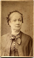
I've posted some cabinet cards for you to download.


This image is unretouched.


These are from my private collection, so download away! The only proviso is that you do not add them to commercial CDs or copyright sheets.


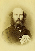
This image has been tweaked a little.


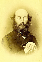
Don't you just love his baldy little head? Just perfect for a vintage Easter card?


Seriously, I love the way his hair curls - including the beard. He must have been devasted at the first signs of a "high forehead". I'd have loved to see him with a comb-over. Did you know that in Japan, they call comb-overs a "barcode head"? Love it!

See the unretouched, large file versions on my Freebies page. Left-click to copy, then right-click to Save Image As directly to the My Pictures folder on your hard drive.

Why large files?
So that you have room (pixel-wise) to play around: crop, sharpen etc, and you'll also get a good quality print at a decent size.

Have fun - and if you make anything with these pix, I'd love to see it.

Tuesday, March 17, 2009

HATS OFF TO ALEXANDER!


Just saw this link on one of the Yahoo lists: Alexander McQueen's designer hats at the 2009 Paris Collections.


Recycled Birdcage
Copyright Alexander McQueen


Which reminded me of this vintage image...


Which just goes to prove that if you wait long enough, things always come back into fashion!

DID YOU KNOW WHY WE USE A QWERTY KEYBOARD LAYOUT?


I just read this in the Serif newsletter, and just had to share:


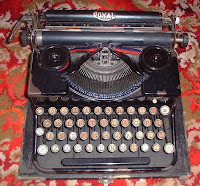
Photo of my old Royal typewriter
You are welcome to copy this (private use only, not for inclusion on commercial CDs or collage sheets)

Why we use a QWERTY keyboard layout

The QWERTY keyboard layout gets its name from the first six letters on the top row of letters underneath the row of numbers.

Originally, early typewriters utilised an alphabetised key layout but this was a problem for a typewriter maker called Christopher Scholes. He found that the typebars often jammed when anyone was typing fast on his patented “Type Writer” and so, after six years, the QWERTY layout was invented. The layout placed commonly paired letters at opposite sides of the keyboard and was supposed to reduce the frequency of the typebars clashing, but initially it slowed typists down which had the exact same effect.

In 1973 Christopher and his business partner James Densmore arranged for E. Remmington & Sons (then famous for manufacturing rifle barrels and sewing machines) to buy the patent and start producing the Type Writer. The first model only offered capital letters and didn’t sell well at all. Five years later the second model (Remmington No. 2) was released and it offered both upper and lower case letters as well as the “Shift” key to alternate between them. Sales took off and the QWERTY keyboard layout became the industry standard.

Even though computer keyboards have no mechanical need to maintain the QWERTY layout,they do so as typists are used to the layout and any change would have a negative impact on productivity.
Hah! If, like me you use an ergonomic (split) keyboard and are a touch-typist, you'll know how irritating it was to have to relearn the position of the "B" key.

The Microsoft keyboard has the B on the left of the split, so you have to type it with the left forefinger. On a standard keyboard, you use the right forefinger. Thanks Bill Gates! (typical MAN - bet they never asked the secretaries!) It took me around 2 weeks to get used to the change.

INTERACTIVE DRESS-UP DOLL


Ever played with paper dolls when you were a kid?


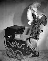
Copyright-free image from Tack-o-Rama (see link in sidebar)

I just found this link online by Pink Parasol on Deviant Art - cyberpunk flash animation Clockwork Couture! Dress-up dolls for grownups - with some pretty snazzy outfits.

Click Enter, then drag&drop the outfits. Much fun!

Sunday, March 15, 2009

STUDIO SPACES

How do you feel about studio spaces? Do you have enough room, and is everything always tidy... or a total mess?

Sally Turlington has made a little video of her new find (library drawers - oh, how I want some like this!) which I couldn't resist showing you.


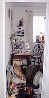
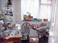
Here's my old studio (the spare bedroom) in the last place we had. Oh, the SHAME of it! I swore to myself that if I ever do anything else in my life, I'll never allow my art space to get into this state again.

View from the landing, before you walk/force yourself into the room. Facing you is a desk (with it's designated chair) plus shelves above and also on the side wall, next to the window.


A closer view of the desk, and looking towards the right you'll see an oval dining table (single central pedestal, so rather wobbly and the cause of many a landslide. Under the table, you'll see a little coffee table! With MORE stuff on.

And why waste a windowsill whilst you are at it?


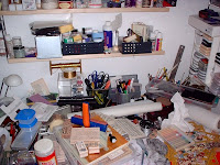
A closeup of the table (as though you really needed one) showing the mess, the latest landslide - and even more STUFF on another chair! I usually had around 6 square inches to work in...


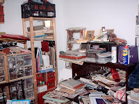
Looking to the right, moving around the room. On the opposite wall to the desk, you'll see the shelving system to end all shelving systems! It still wasn't big enough. Behold the Muji drawers (sadly discontinued) with some of my vast collection of wood-mounted stamps.

Behold the gigantic boxes on even more shelves, above. The white edge to the right is the side of the door - I couldn't get any further back for a better shot.


Moving around the room a little more, we turn the corner to the wall opposite that window. Yes, it is a step ladder. Why? Your guess is as good as mine... possibly to get up to the top of the shelves?


To the right - a bureau with a drop-down leaf (rather nice actually) but covered, and I mean covered, with yet more art supplies, work in progress etc.


Turning right again, we are now looking at the back of the door we came in - with a rolling card, yet another dining chair holding some ring binders and a filing box, plus another unspecified box balanced precariously on top. On the back of the door, yet more STUFF.


The desk, facing you as you walked/forced your way into the room. Shelves above, shelves to the side, drawers underneath the desk... and not even an inch to work in!


The computer area: under the stairs, in the open-plan living room. This was quite a large alcove: the table was 120cm wide. It's still a sea of papers, and a total nightmare to work at.


Talk about disorganised....I think about the only thing missing was a roof rack!

We have since downsized to a 1-bedroom flat (hence the name of the blog) so even less room! I posted about my new small-space studio here, if you want to see it.

Still, I thought these pictures of the normal state of affairs at our old place (2-bed maisonette on two floors) would:
(a) amuse you
(b) possibly make you feel better!

I know one thing I have in common with Sally, and probably a lot of you out there, is MESS - and an ongoing battle to keep everything under control and yet still be able to find your stuff.

I had a big tidy around a couple of weeks ago, but put all my stickers/labels/rub-on lettering In A Safe Place - oh boy. Yes, you guessed it... I have been turning the place upside down ever since (4 separate sessions) and still haven't found where I put them. I have a nasty feeling I'll have to buy some more.

Friday, March 13, 2009

HAPPY PINK SATURDAY


Happy Pink Saturday everyone!


Go and see Beverly at How Sweet the Sound to see the list of all the blogs who've joined in.

Here's my contribution: two copyright-free collage items from my own private collection: a little Victorian calling card, and a highly coloured Edwardian seaside postcard.


Click on the thumbnails for the full sized images, and right-click to copy to your hard drive. These are high quality scans, therefore large files, so will take a little time to upload.


Do as you like with them - but please appreciate these are for private use only, including works for sale - but not to be distrubuted in commercial CDs or collage sheets.

Enjoy!

Thursday, March 12, 2009

MORE FREEBIES

Here are some more pages from The Best Way (see post below).

This one tells you how to clean a tigerskin rug!


Like we just happen to have a few of those dotted around ... this book was written in the old British Raj days: huntin', shootin' and fishin'.

Click on the pix for the full sized images, which are raw scans (totally unretouched). Again, these are large files (so they will take some time to upload).


Yours to do what you like with them, including creating works for sale. However, they are for private use and not to be included on commercial CDs or collage sheets.

SCREEN PRINTING A T-SHIRT

Here's a brilliant little video on how to screen print a small item - costing virtually nothing to set up!


down and dirty screenprinting for under 10$ - More DIY How To Projects

I can see tons of applications for this. One thing I do miss from my art college days is screen printing - I really enjoyed it. But when I examined the set-up costs a couple of months ago, I found it scary to say the least!

I love this video - and how nice that I can print off the instructions to keep on my work table (which had probably better be the kitchen worktop, with a large sheet of plastic over to protect it...)

Wednesday, March 11, 2009

FREEBIES

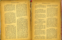
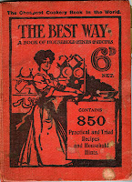
This lovely old book (circa 1890) has a mix of recipes for cookery, care of clothes, furniture etc.


Some of these are really quirky so I thought I would share before the book disintegrates altogether (I bought it at a car boot sale and it was in very poor condition).

Click on the images and right-click to copy them. They will take some time to load as they are large files (scanned at high resolution) and are completely unretouched.


The cover is stained and the edges are badly discoloured (the paper is cheap and very brittle) but I think that's part of the charm.


Do with them what you will - however, they are for private use, including work for sale but NOT for sale as part of CD or collage collections.

Tuesday, March 10, 2009

AND THE OTHER WAY TO MAKE A BUTTON...

I just got a comment from KBeau

See the post below (thank you so much for this) who tells me there is an easier way to make a button (after I just spent 2 hours trying to get Blogger to take the code, and ending up pasting it into a gif. Aaargh).

If you don't fancy typing any code, or don't have an external photo store (Picasa, Photobucket etc) you could do this instead:

KBeau says (I have paraphrased just a little):
In Blogger, you upload a picture directly from your computer instead of from an external site.

Once you have your picture, go to Layout > Page Elements > Add a Gadget > Add a Picture.

Locate the picture on your hard drive (or it can be on a website), and upload. Blogger will even shrink it to 220 pixels wide. Plus you have the option of making it clickable by typing in the website that it will link to (there is a box for that).
Isn't it nice to have a choice? Thanks, KBeau!

MAKE YOUR OWN BLOG BUTTON

I have noticed a lot of people like to put buttons on their blog, and I finally worked out how to do one myself!


So of course I had to share how I did it:

  • Create/save a picture or photograph in your favourite graphics editing programme. It needs to be saved at thumbnail size, around 120 - 150 pixels wide, and whatever you want the height to be (you may want oblong or square, you may want tall & thin). Most blogs will be happy with 120 pixels wide.
  • Create a line of text on top of your pic - either as a separate layer, or as a text box, depending on the programme you have. Save the image as a jpg. (In Photoshop, Paint Shop Pro etc you may need to flatten it before you save it).
  • Upload your image onto an external site like Photobucket, Picasa or Flikr.
  • In Blogger, go to Layout > Page Elements > Add A Gadget
  • Click on HTML/Java Script, and copy&paste the code below in the box, substituting your own code in between the "" marks: the first set will be the url of your blog, and the second set the url where you stored your picture (which should be a jpg).
  • Replace the instructions highlighted in RED with your own urls.
And that's it! If you hate it, simply delete the HTML/Java Script box.

Please note this is not a clickable button, just a pretty one to liven up your blog.

Let me know how you get on.

Saturday, March 7, 2009

YET ANOTHER BACKGROUND

You'll notice I changed the blog's background yet again!


Copyright free pic from Tack-o-Rama


I just discovered this designer, Itkupilli - who is Finnish, based in Los Angeles.

Her blog, which offers free backgrounds and lots of other goodies, is Cute n Cool Blog Stuff - although I'd call it highly artistic myself, and not cute in the usual sense of the word. I love it! I changed the BladeRubber blog as well. Free headers, blinkies etc are also available! I've put her button in the sidebar so you can find her again.

You'll also notice I have changed back to 2 columns - I wasn't that happy with 3 - I thought it looked crowded. I adjusted the 2 columns just slightly - the left one is a little wider, the right a little narrower, and there's a slightly bigger gap between the two. I hope this makes it more readable, and that the colours are more restful to the eyes. I find I just cannot be doing with white backgrounds.

You'll also notice the colours in the tag cloud have changed - I adjusted these as well, so it just goes to show these things are possible, even if you are very html challenged (and don't really know what you are doing.... I just follow the instructions blindly, and pray!)

Friday, March 6, 2009

PINK SATURDAY - LITTLE BOOKS

Happy Pink Saturday to everyone!

Go and see Beverly's Pink Saturdays list at her brilliant blog How Sweet The Sound to see lots of Happy Pinkness.


I am going to make sure I visit everyone this week!


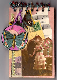
Little vintage notebook
copyright Susie Jefferson


This was just an ordinary shorthand notebook, which I altered/embellished.
  • I pulled the wire coil out, then recovered the covers with pink Mulberry paper, torn collage papers, a little German Scrap and torn vintage postcard.
  • I reassembled the book, and attached the wiring by placing a pencil on the top edge and wound coloured wire through the holes, over the wire (to keep that nice rounded shape) throught the holes, back around the pencil etc etc, and continued to the end, working from left to right.
  • I wound all the way back through the holes again, and finished off where I started by twisted the ends together (using pliers) to fasten. I threaded on tiny beads before I started winding the wire.
  • Finally, I added a tag (also pink, with more collage) and dangled it off the front of the book.


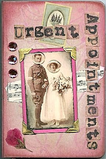
Wedding Organiser
copyright Susie Jefferson


This was a mini organiser in Kraft card (brown and dull, dull, dull).
  • I prepped this by swiping over the entire surface (inside & outside) with white pigment ink. I used a mini pad, so I could get into all the crevices.
  • Once this was dry (about half an hour) I went back over with more pigment ink, blending VersaColour in Opera Pink with Colourbox Chiffon White. Over the top of that, I stamped with a flower stamp using Brilliance Orchid Pink.
  • Although these are different brands, they are all pigment inks and so all blended happily together.
  • I finished off with flatback "gems" in pink, plus alphabet stickers, torn vintage sheet music and a mini vintage postcard.
  • There's more collage inside, plus a pocket for business cards.
This was a private commission for the Mother of the Bride, who used it to organise everything: flowers, food, bridesmaids etc - so all the contact numbers, fabric snippets etc, were all in the one book which fitted very neatly into her handbag - and lived with her for around 8 months!

This idea might also be a good one for someone expecting a baby, a big anniversary celebration etc - anything that needs a lot of organising that you don't want mixed up with your other contacts. And it would make a fun keepsake for later - get rid of the addresses and fill up with photos.

Happy Pink Saturday!

TECHNO GROUSE - SORTED!

I sorted out my colours! Hooray!

I bet you are wondering what I did... and how I did it! I'm giving you the full bit-by-bit scenario, hoping this will be a great help to anyone else in the same position.

First off, I spent hours looking up solutions on Blogger (I never did get a reply from the Forum) and I found this link which sounded exactly like the problem I had.

The culprit was Word! Writing your posts in Word, or copying&pasting sections of Word documents (which have tons of messy code not compatible with Blogger) is what was causing the problem. In particular, my having put in links which were in a Word document. These always default to blue - and override any Blogger commands. Word fonts also override Blogger - but I had noticed these and sorted them out at source before I posted my articles. Shame I didn't notice the links thing at the time. Who would have thought?

SO... I now knew I had cut&pasted some Word documents into Blogger (to save retyping them all). I knew Blogger didn't like the coding, and I kept getting error messages when I hit the Publish Post button. I was getting round this problem by hitting the Delete button, then hitting Publish Post again - then Blogger highlighted more unacceptable code - I deleted it, hit Publish again... etc etc ... and eventually the post would publish. Everything looked fine on screen - then suddenly all my Links turned brilliant, strobing blue (aaargh) and the Visited Links purple (eurgh).

Having spent many a happy hour trying to find out what to do, I came across the post in My Blog is Broken in the Help Section (as mentioned above) which outlined the problem I had - the solution being that I had to find out which post was causing the problem. Which entailed hours of tedium and eyestrain as I had to look at each post's html code, one by one.

HOW TO DO THIS

Go to Edit Posts, then tick the box beside the suspect post and click on Edit. This brings the post back up onscreen. Click on the Edit Html tab. This lets you see all your code.

To find out if this particular post has the fault, click CTRL + F on your keyboard, which opens up a toolbar just above your bottom toolbar (at the bottom of your screen).

You'll see a white box with Find: beside it. Type in a:link and hit Enter. If your post has the problem I had (ie: the colours kept defaulting to blue & purple, and overriding the colour codes you typed in in Settings) the section will highlight for you (see below). This only works if you are already in the Edit Html view.

Right - you found it. Now what do you do? Take it all out. You'll find you have a ton of Word code in there. Click over to the Compose or Preview views to see how it looks,and whether you have deleted anything important. If you did, hit Edit Posts again and when prompted to Save or you'll lose your work, don't save it (because you DO want to lose it) then go back into Edit Post and have another go.

You'll find the Word stuff is very obvious - a whole chunk of code, and in there is the font: blue etc stuff. There will also be some code immediately after about underlining, which you also don't want. As per the link I gave you at the top of this post, your code will look something like this (notice the highlight:
a:link, span.MsoHyperlink {color:blue; text-decoration:underline;
text-underline:single;}
and
a:visited, span.MsoHyperlinkFollowed {color:purple; text-
decoration:underline; text-underline:single;}
Once you have got rid of all the code you don't want, hit the Save Now (blue button) which saves as a draft, then view the blog - all your link colours should have changed. If you are happy with everything, you can now go ahead and Publish Post, and your link colours will be back to what you want them to be.

CUSTOMISING THE LINK COLOURS

The next issue I had was that I didn't like the colour choice I was offered. To go with the blog skin from TheCutestBlogOnTheBlock, I wanted my links to be more of an olive and a khaki.

To do this, I changed the colours in Layout, Fonts&Colours, by clicking on Links - you'll see a block of colours o the right, and to the right of that is a box titled Edit Colour Hex Code. The colour code will have a hash symbol: # and some numbers and/or letters. Do not delete that hash symbol!

Find your colours on this chart and follow the directions carefully. To change the colours in html you would type in the numbers individually. For example, the colour might be #000000 (this is that awful blue default colour).

I wanted to change to olive, so typed in #999933. (For example, on the BladeRubberBlog, one of the colours is #a9501b which is a deep russet).

In the Hex box, I have #999933, the colour value, which is in effect the title of the colour. In the html code in the body of the post, you would see it as (153, 102, 51) which is the red, blue, green mix used to obtain the colour. This would be particularly applicable if you want to create a tag/label cloud, as I have on both blogs, as you have to edit the colours yourself (see my post further down).
This is how my Labels cloud looks on the BladeRubberBlog:

var maxColor = [204,102,0]
var minColor = [255,204,153]

This is telling the cloud that the most hits will be the maxColour, fading to the minColour for the least number of hits.
All this is completely do-able, even if you haven't meddled with your html before (I hadn't)! Always, always, always make sure you did a backup first, before you meddle.

Comments, champagne, chocolates and large amounts of praise graciously received, LOL.

Whew!

Thursday, March 5, 2009

RANSOM NOTE GENERATOR

I just found a new fun geeky gadget to play with, the Ransom Note Generator.

Whoever thought this up is a genius: type in your message, press Generate and you get a printable ransom note. Waaaay cool!

I love stuff like this!

TECHNO GROUSE

I'm fed up & frustrated!

Copyright-free pic from Tack-o-Rama


You all know me by now, pretty determined in the face of total NON co-operation by machinery in general, and this bloody computer in particular, which can be very defiant. You heard how it fights me tooth and nail at every turn (read the Computer Woes posts if you are really interested in me droning on) ... and now my blog is turning against me too!

As you all know, we can change our colours etc in the Settings menu ... but... I cannot change the Link and Visited Link colours! Don't you just hate hate hate that screaming strobing blue and purple! But it seems to be set in stone, and I can't change them. I have even emailed Blogger (no reply) and the The Cutest Blog on the Block people (who I notice now have a "change your link colours" section on their web) so they listened, which is brilliant - but unfortuately the advice didn't work.

So somehow the colours keep defaulting to those you see. No idea why. I have changed the blog template, which should have fixed it (but didn't) then deleted the TCBOTB skin, which should have fixed it (but didn't) and then went into the html and typed in the colour codes, which should have fixed it (but didn't). Ditto deleting cache & cookies. Aargh.

Yet, as you see, I managed to change to a 3-column blog, put in a signature (on the BladeRubberStamps Blog) and a Tag/Links Cloud section (I put the link here for you as I can't remember how I finally got to that page... it took some tracking down!) so I am getting more computer-savvy, except I hit yet another brick wall.

So if anyone has any brilliant ideas, email me! Please!